While taking a Design for User Experience course at USC, I was tasked to create a user interface for an accommodation application. The project had specific required features, such as horizontal scrolling and overlays. With these features in mind, I ideated the creation of Pro Pods, a capsule hotel catered to working professionals and travelers looking for affordable accommodations in New York City.
User Interface Designer
2 months
Figma
From conducting interviews with several travelers, I found that a major issue within accommodations, is the lack of affordable rooms, especially in larger cities where space and land is very limited. This is large issue, especially for on-the-go professionals and way-fairing tourists who don’t need private living spaces when they’re always on the move to their next destination.
Professionals and tourists want to book accommodations which are affordable, have a good location, and allow flexibility in their experiences.
To reach the problem outlined in the previous section, I initially interviewed multiple travelers about their experiences with hotels and finding accommodations. From these interviewers, I was able to get these specific responses.
“The most difficult part about traveling is finding a place which is not only has a good location which allows me to explore and connect with the city, but to also find one which is affordable for my lifestyle.”
“I think the most important part about going to a new city, is be able to understand and experience the culture first hand. It just isn’t the same if I have to commute to experience everything New York has to offer.”
“As a business professional, I’m always on the move and having a space where I can work and also relax is super important to me.”
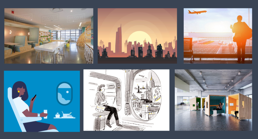
Using the aesthetics and colors from the mood board as the basis for my design, I developed an application design which is both fun and professional. This including a mix of warm and cold tones to accent the modern features of my design.
During this time, I also started working on some prototypes of small components within my application, for such as horizontal scrolling of the different type of room accommodations. During this process, I had to decide which order to place the accommodations; from most to least expensive (Option A) or the least to most expensive (Option B).
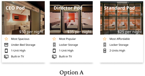
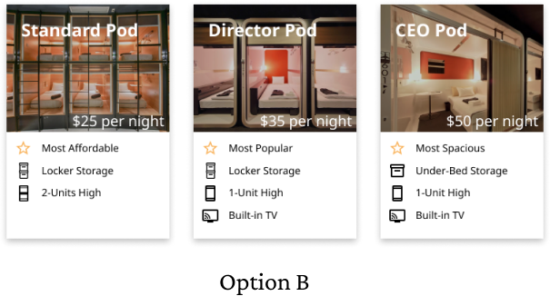
After showing the two options to a set of possible users, I found that Option B would be the better visual display which would attract more users to booking at Pro Pods.
To ensure the interactivity of my design, I made sure to make a number of connections between frames to allow users to understand the full experience of this application. The sidebar menu was the main driver of the interactivity and connectivity of the frames within my design.
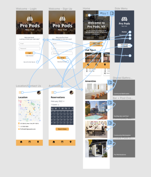
My final designs for this application results in five different interactive frames, with my home page including the number of features, such as horizontal and vertical scrolling and a number of overlays upon the various amenities offered at Pro Pods.
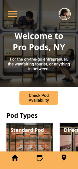
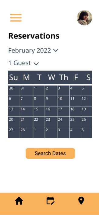
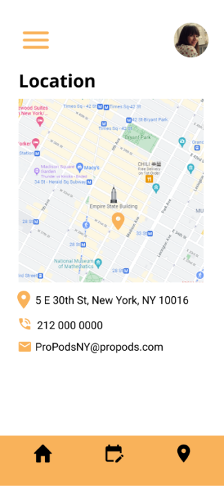
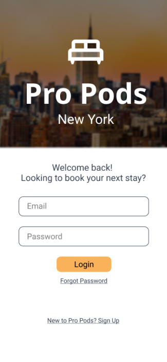
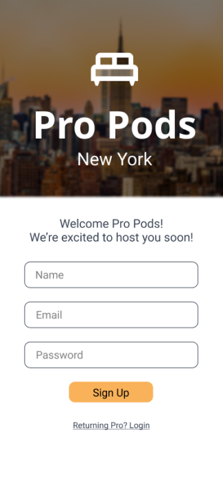
Having the opportunity to create this project was an extremely rewarding challenge. Starting from scratch allowed me to be creative with my designs and the requirements of various features had me learning new tools and concepts within Figma. As a result, I was able to practice and perfect my ability to design and prototype an application while also improving my understanding of design theory and user-interviewing. Next time, I want to spend more time in the user research section of my design and be able to get even more feedback from potential users.