Mochi is a wellness and organizational mobile application which is catered toward content creators. It's goal to help create structure in the lives of their users and offer customization goals for users to work toward. It was developed during CreateSC 2022, a virtual UX/UI designathon hosted by Innovative Design at USC. It was ideated and designed over a span of 24 hours by two teammates and myself.
User Interface Designer
24 hours
Figma
The following is an abridged version of the brief was given to my team. View the full prompt here: Notion Prompt
"A fundamental basis of good product design is an extensive understanding of user needs, and how to address those needs within design. Traditionally, user research is conducted with the assumption that the user knows exactly what they need, but oftentimes... that assumption can lead to a negative influence on the user...This is why user wellness is important. A focus on user wellness means that the designer incorporates design solutions that empower the user, while still aligning with business goals."
Our Task: Design a mobile app that promotes and reflects the principles of wellness in design
With our task in mind, we began brainstorming with a focus on designing to address an issue which we all cared about. Examples of markets we looked into were gaming, fashion, livestreaming, and content creation. In the end, our initial research and understanding of these different markets found that the largest gap for wellness was in the growing field of content creation.
Content creation as a profession is very new with limited research and understanding of the experiences of those in the career. However, as someone who has had the opportunity to connect and meet those in the industry, some qualms I've heard include lack of work-life balance and burnout due to lack of structure in their lives.
To ensure that we addressed the most significant wellness issues in content creation, we employed the use of a survey to collect information from creators and livestreamers of all sizes. Some comments that they made include:
“I'm not able to manage the stress [of content creation] and I end up not being able to stream nearly as much because school and sports”
“I'm not doing a great job balancing [content creation]. Content creation is a lot more fun for me than doing stuff I should be doing, so I kinda just let [my other work] pile up.”
“[I need to remind myself] to do simple things like drinking water”
Based on these survey results, we determined what frames we wanted to develop, such as calendars and mood trackers, and it allowed us to narrow down type of content we'd be providing on our application.
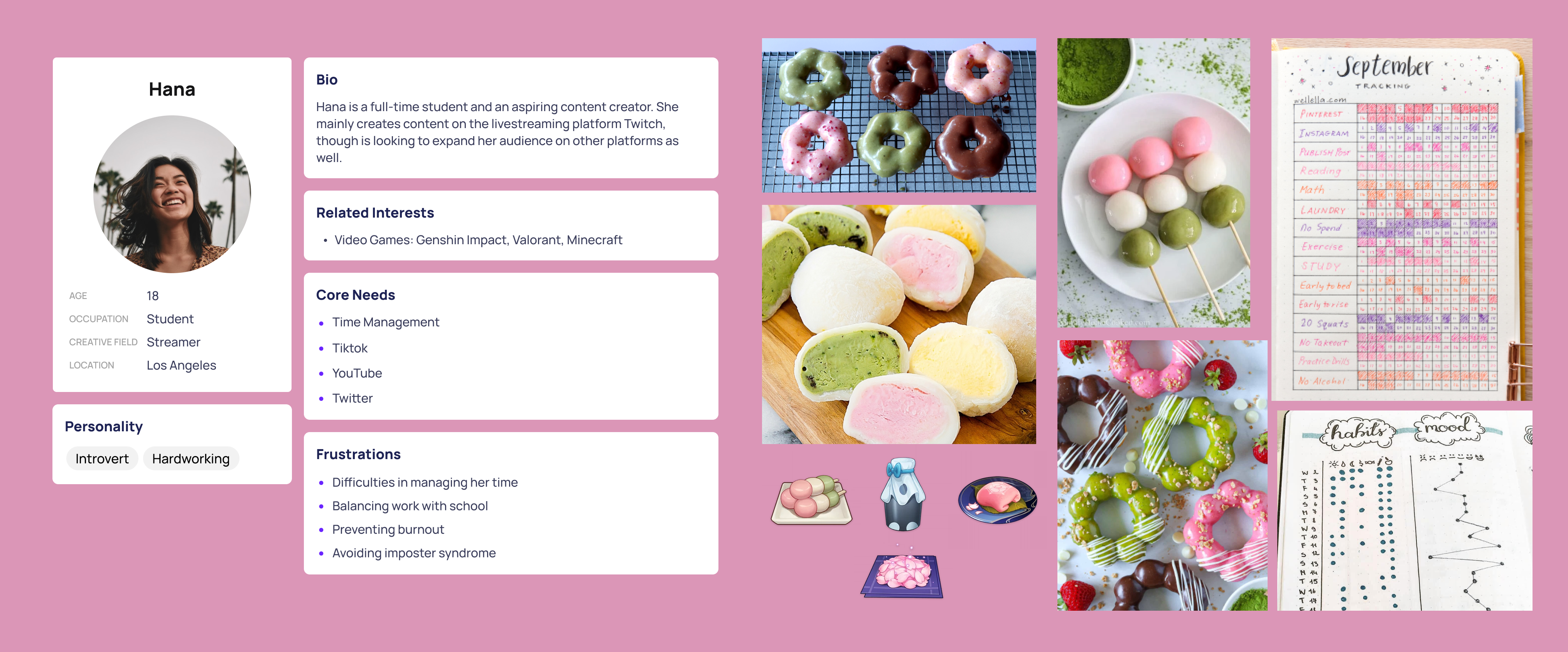
To begin our design process, we first compiled a moodboard to bring our design together. Below is our initial inspiration, a user persona, and color scheme which we carried throughout our design.
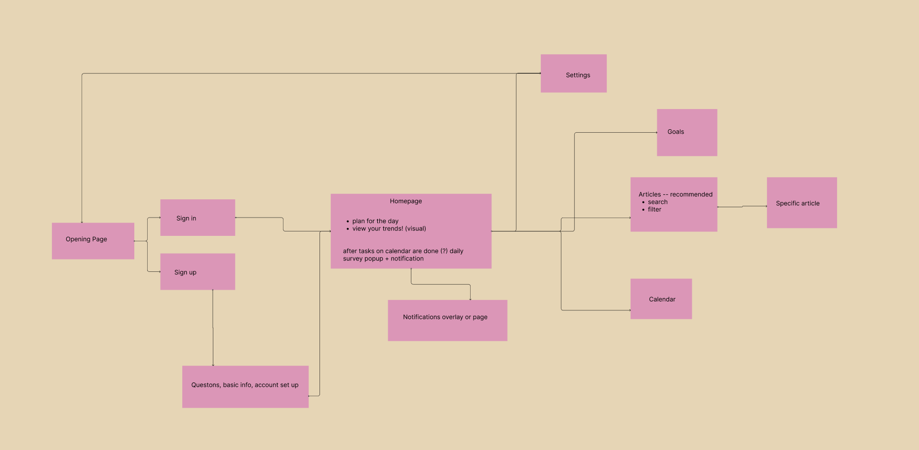
With our basic theming and understanding of our audience completed, our wireframe planning moved toward creating a flowchart to outline the user experience.
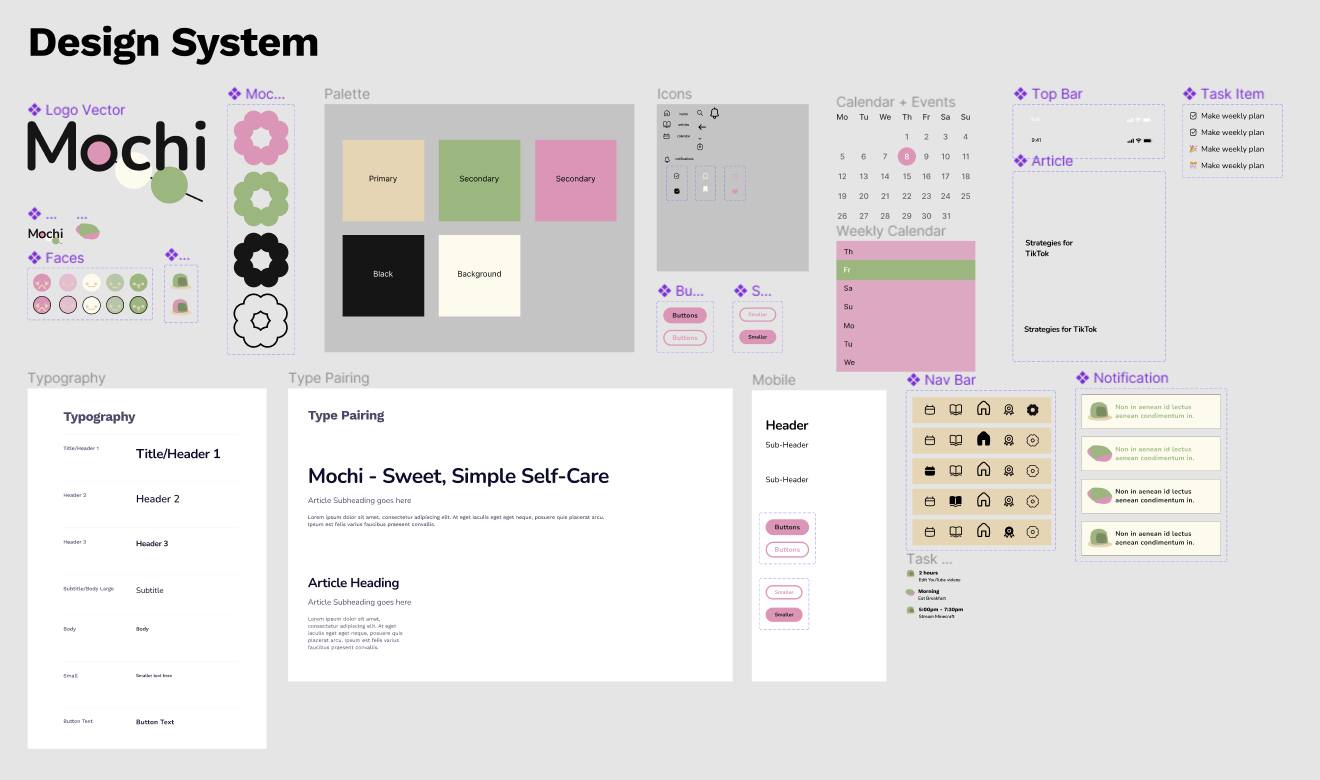
We then began prototyping our application using Figma. We developed a design system which would allow the 3 of us to create consistant designs over the next 24 hours. In developing the design system, we wanted to focus on developing microanimations which would make it easier for the user to interact with our application.
Using the design system above, we developed the application's user interface frames and began prototyping by connecting the frames together in Figma. A lot of the interactivity was connected to master components within the design system. For example, the navigation bar.
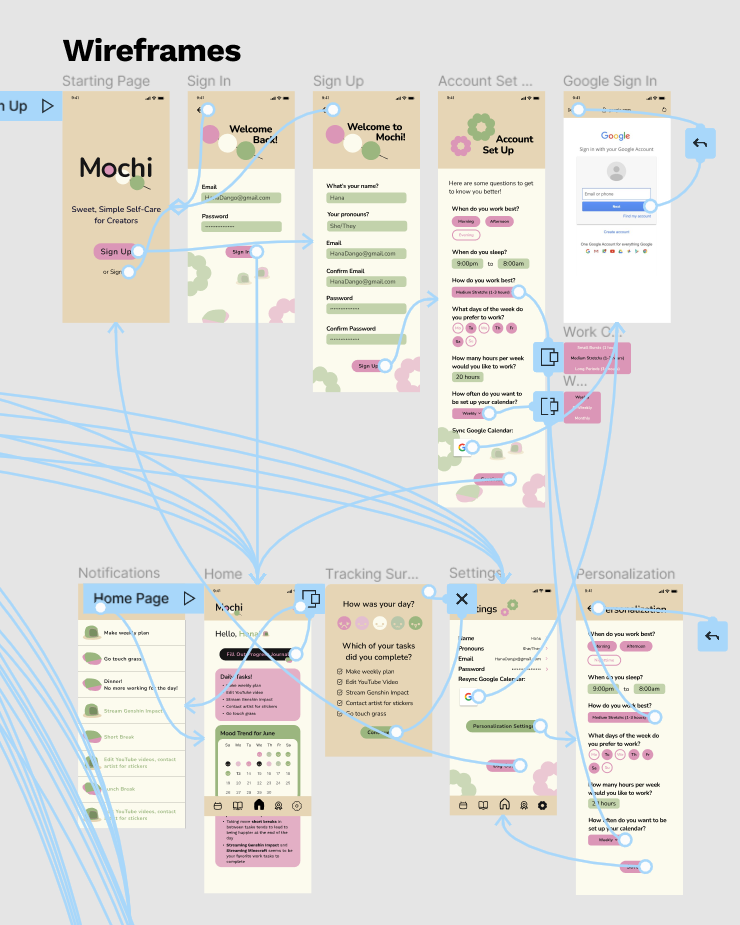
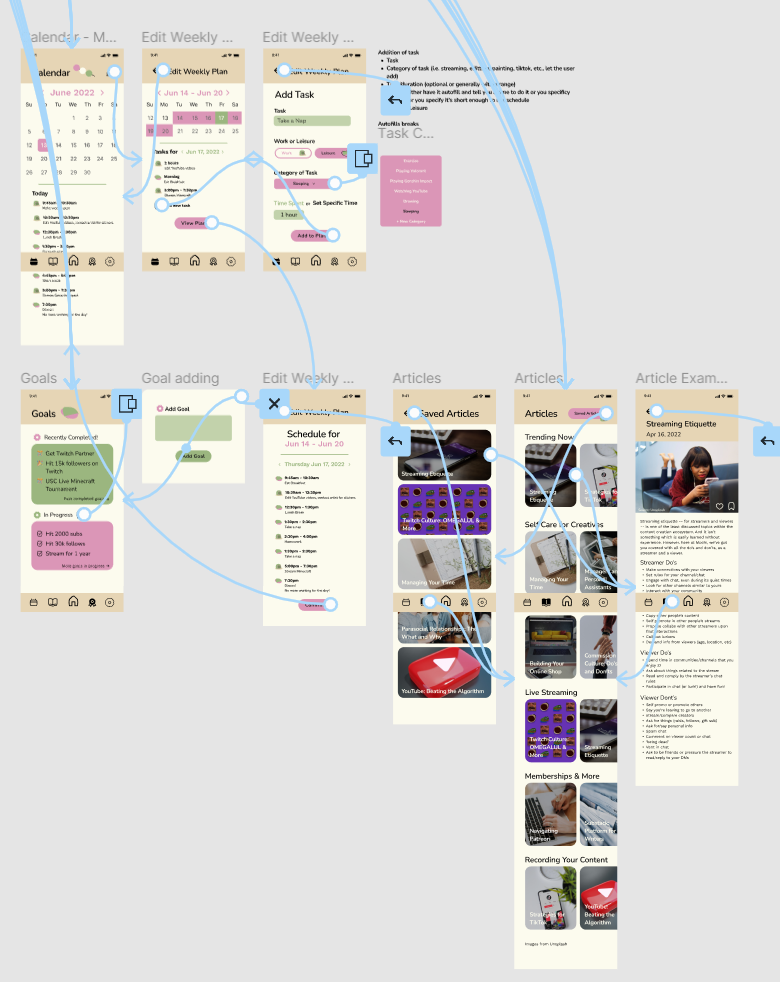
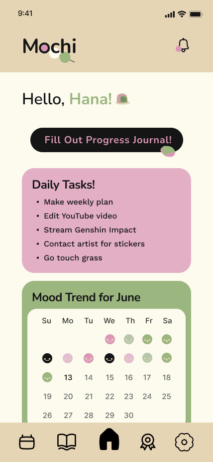
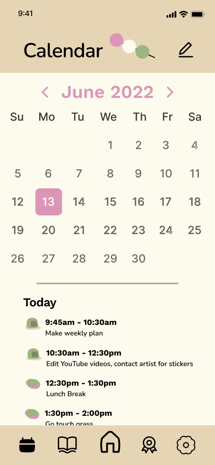
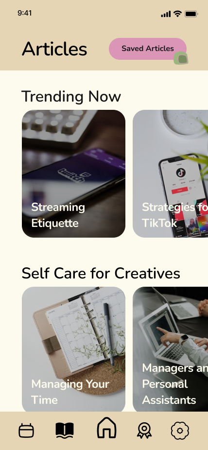
The final designs for Mochi's mobile application include 18 frames, 5 overlays, a number of horizontal and vertical scrolling, and interactive microanimations. Below are 3 of the frames -- if you'd like to view the design system and wireframes, feel free to click this link. Otherwise, click the button to view the interactive prototype.
Working on Mochi was one of the best experiences I've had developing a UX/UI solution. Even though time constraints prevented us from creating more interactive features and polishing up the design, I had the opportunity to practice using my Figma skills to create something which I believe would help many current and upcoming content creators -- some of which include close friends.
Having only 3 people working on this project taught us a lot about managing our time and focusing on only developing features which we believed would be the most impactful. Generally, it made sure we were realistic and focused on the main purpose of this product.
As someone who is not classically trained as an artist, I learned a lot about digital art in Figma, especially when designing the logo of application. I think the theming was very cohesive and added to our application's visual design.
In the future, there's a number of things which I'd love to implement or ideate. On the design side, this includes improving notifications and creating smoother transitions. In terms of user research, I'd love to do more interviewing and A/B testing on our designs to ensure that the design is initutive and address the concerns of our content creator audience. Lastly, as someone who also has a Computer Science and coding background, there were a number of features and ideas which my team had but weren't able to implement as a result of the limitations in Figma. For example, local storage and visualization of things altered by the user. I think these features would bring our application to life.